I turned all my sites into iPhone apps
Because iOS just makes everything look better
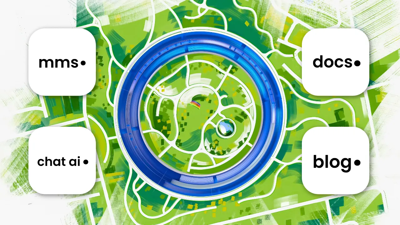
Small confession: I just wanted to see my own stuff on my home screen. That’s it. That’s the whole motivation. I have a portfolio, a blog, a chat AI persona of myself, and a docs site for my AI learning notes — and every time I opened any of them, it was just another Safari tab buried in a pile of other tabs. I wanted a little icon. I wanted to tap it like a real app.
Turns out, that’s basically what a PWA (Progressive Web App) gets you, and it’s a lot less work than I expected.
What I actually did (not much, honestly)
I went through four projects — chat-muhammedshah, muhammedshah.com, blog-muhammedshah, and docs-muhammedshah — and gave each one:
- A web app manifest — a small JSON file that tells the browser “hey, this thing has a name, a color scheme, and it should act like a standalone app, not a browser tab”
- A proper icon set — 192px, 512px, and a 180px
apple-touch-iconspecifically, since that’s the one iOS actually grabs for the home screen - A handful of
<head>tags — manifest link, apple-touch-icon link,apple-mobile-web-app-capable, and theme-color so the status bar matches the site instead of looking like a stray Safari sliver
That’s genuinely it. No app store, no native code, no Xcode. Add to Home Screen on iOS reads those tags, and suddenly there’s an icon sitting next to my actual apps that opens full-screen — no address bar, no browser chrome.
The one thing I deliberately skipped
Every one of these is a content site — a chat UI, a portfolio, a blog, docs. None of them have data I need to survive without internet. So I skipped the service worker / offline-caching part of the PWA spec entirely on all four. That’s the part that would let an app open with no connection at all, and it’s genuinely useful for something like my nutrition tracker (a proper habit-logging app I use daily), but total overkill here. Icon + installability was the whole ask, so that’s all I built.
Each site had its own little wrinkle
Nothing was copy-paste, because none of these four projects use the same stack:
chat-muhammedshah (Next.js, Pages Router) — this one didn’t even have a pages/_document.tsx yet, so I had to create it just to get a place to put the static head tags. Generated the icons straight from the existing chat logo with sips (built into macOS, no extra tooling needed).
muhammedshah.com — plain HTML/CSS/JS, no framework, no build step. Honestly the easiest of the four. Just drop a manifest file at the root and add the tags directly into index.html.
blog-muhammedshah (Astro) — one shared BaseLayout.astro file, so a single change covered every page on the blog at once. Had to double check the post layout actually extends the base layout rather than being its own separate shell, otherwise posts would’ve been left out.
docs-muhammedshah (MkDocs Material) — this one was the interesting one. Material for MkDocs has never had built-in PWA manifest support — not in the version I’m pinned to (9.6.15), not in any version, confirmed by digging through the changelog and some genuinely ancient open GitHub issues from 2019 still unresolved. So instead of fighting the theme for a feature it doesn’t have, I used MkDocs’ own theme-override mechanism (custom_dir pointing at an overrides/ folder) to extend the base template’s head block by hand. Small bonus: while I was in there I noticed the site’s favicon had been sitting at 65×65 this whole time — way too small to make a decent app icon — so that got swapped for a proper 1080×1080 source logo too.
Why this is more useful than it sounds
The nice part isn’t really “look, an icon” — it’s that these sites stop feeling like things I visit and start feeling like things I have. My chat AI persona is one tap away now instead of a URL I have to remember or dig out of bookmarks. Same for the docs site I use constantly while going through AI learning material. It’s a small trick, but it changes how often I actually open the things I built.
And the honest technical takeaway: a full “installable app” is a manifest file, some resized PNGs, and a few meta tags. That’s a much lower bar than I assumed before actually doing it.
Four sites, four different stacks, one small afternoon. Worth it just for the home screen row alone.